Project
OttoParking
What I did
Redesign, UI/UX
Release
April 2023
Link
Seamless parking experience through innovative cutting-edge UI/UX integration.
Introduction
Otto Parking stands as a groundbreaking digital solution in the realm of parking management. Developed by PT Meta Media Infranusantara, a subsidiary of PT Nusantara Infrastructure with an extensive history in infrastructure development, including toll road management, Otto Parking addresses the challenges inherent in parking management.
The application's main objective is to streamline and enhance the parking experience for users while providing an integrated system for payment, reservation, and information dissemination.
Traditional parking systems often suffer from inefficiencies, cumbersome payment processes, and disjointed communication. Otto Parking seeks to transform this landscape by introducing cutting-edge technology to every facet of parking management. Whether for property owners or parking service users, Otto Parking aims to create a seamless, unified experience that transcends limitations, encompassing both programs and service facilities.
The app itself is designed to allow users to effortlessly manage parking, make valet reservations, and conduct payments, all within a unified and cohesive ecosystem. By integrating vital aspects of parking management and leveraging PT Nusantara Infrastructure's extensive experience, Otto Parking strives to become a hallmark of innovation and convenience in the field of parking solutions.
Then, what is the background of the company's rebranding and my role as a UI/UX Designer? With a commitment to continuous improvement, PT Nusantara Infrastructure embarked on a journey of rebranding, aiming to align its visual identity with its technological advancements and forward-thinking approach. In this context, my role as a UI/UX Designer was pivotal. The previous design had inadvertently violated several fundamental principles of user experience (UX), exhibiting inconsistencies in iconography, layout, color usage, typography, and an overall outdated appearance.
Employing the principles of Clean Design and adhering to the User-Centered Design methodology, I set out to address these issues comprehensively. The new design not only needed to be visually appealing but also intuitive and user-centric. Aiming to create a cohesive visual language across multiple applications under the company's umbrella, I dedicated myself to crafting consistent and aesthetically pleasing iconography that resonated with users and maintained alignment with the rebranding initiative.
By meticulously addressing each violation of UX principles and employing a human-centered approach to design, I not only revamped the application's aesthetics but also redefined the user journey. The result was an intuitive, visually appealing, and technologically advanced application that aligned seamlessly with PT Nusantara Infrastructure Tbk's renewed brand identity.
In summary, my role in the rebranding of Otto Parking was to translate the company's commitment to innovation and excellence into a coherent and engaging user experience. By adhering to modern design principles and creating a unified visual language, I helped usher in a new era of parking management, where convenience, aesthetics, and user satisfaction are seamlessly integrated.
Challenges and Goals
1. Deeper Insight into the Issues with the Original Design
The original design of Otto Parking posed several significant challenges that necessitated a comprehensive redesign. The redesign was aimed at aligning with international standards, specifically ISO-9126 for Software Evaluation, which involved an Attitudinal-Qualitative research approach. The original design exhibited a lack of visual consistency and coherence, and it violated several key principles of user experience (UX). Additionally, the interface's intuitiveness was compromised, and the UI/UX had become outdated. With Otto Parking's rebranding efforts underway, it was clear that a redesign was essential to address these issues.
2. Goals and Vision for the Redesign
The objective of the redesign for Otto Parking was to elevate the user experience to a level that met and exceeded international standards while aligning with the company's refreshed brand identity. Several goals were outlined to guide the redesign process:
-
a. Implementation of UX Laws and Principles: The redesign aimed to adhere to UX Laws, particularly Jakob's Law, by incorporating Clean Design principles that users are accustomed to from other applications. This would ensure familiarity and ease of use.
-
b. Simplicity and Ease: The overarching aim was to simplify the user journey, enhance usability, improve navigation, and provide clarity of information. The intention was to create an intuitive and seamless experience, making the app easy and enjoyable to use.
-
c. User-Centered Design Approach: The chosen strategy was the User-Centered Design approach. This decision was driven by several factors, including:
‣ User-Focused Redesign: The approach placed users at the heart of the redesign process, ensuring that changes were informed by a deep understanding of user needs and preferences for Otto Parking.
‣ Business Alignment: The user-centered design approach also addressed business interests. In a competitive digital parking industry, offering a superior user experience could set Otto Parking apart from competitors. A user-centered design would lead to a more intuitive, responsive, and user-friendly application compared to rivals.
‣ Business Performance: The improved user experience could lead to better user retention rates, higher customer satisfaction, and subsequently, increased transaction volumes and revenues for Otto Parking.
In conclusion, the redesign of Otto Parking was not merely about aesthetics but was a strategic decision to elevate the user experience to a globally recognized standard while aligning with the company's rebranding efforts. The use of the User-Centered Design approach ensured that the redesign would not only enhance user satisfaction but also contribute to business growth, competitive differentiation, and sustained success in the digital parking landscape.
Research Methodology and User Findings Analysis
1. Competitive Audit
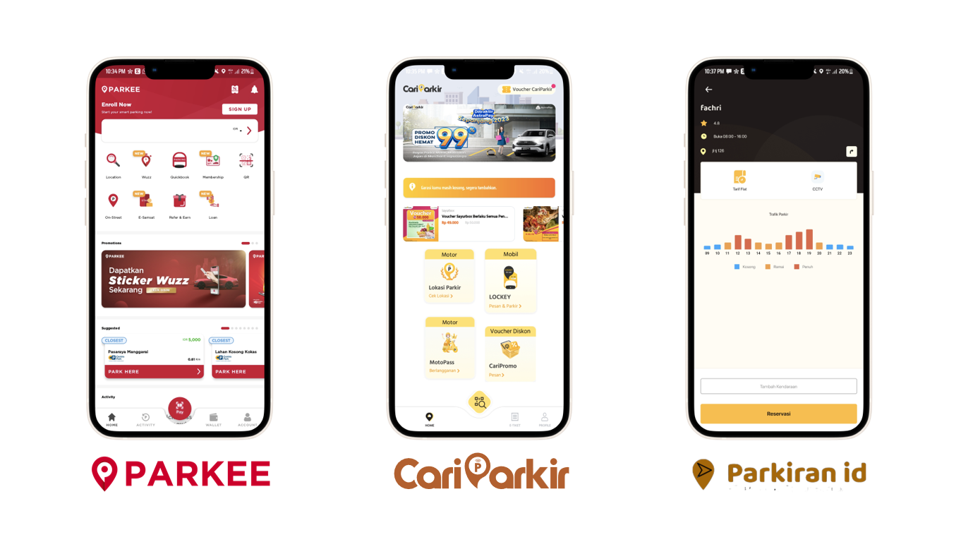
For the Otto Parking project, I employed a thorough research approach, including a competitive audit of three benchmark applications. The results of this competitive audit provided valuable insights into industry best practices and user preferences. Here's a summary of the findings:
A. Parkee:
- ‣ Strengths:
- a. Modern and elegant interface design.
- b. Attractive visual design with bright colors and good contrast.
- ‣ Weaknesses:
- a. Poor typography that hampers readability.
- ‣ Adaptation that Otto Parking could do:
- a. Otto Parking could adopt visually appealing and clear design elements similar to those observed in Parkee.
- b. Emphasizing legible and user-friendly typography would differentiate Otto Parking from competitors.
B. CariParkir:
- ‣ Strengths:
- a. Prominent call-to-action areas for easy access to features.
- ‣ Weaknesses:
- a. Poor color contrast with the background, making it difficult to read.
- b. Subpar typography, affecting readability.
- ‣ Adaptation that Otto Parking could do:
- a. Designing easily accessible call-to-action buttons would enhance user experience.
- b. Optimal color selection for each component would distinguish Otto Parking from its competitors.
C. Parkiran.id:
- ‣ Strengths:
- a. Provides information about parking availability at specific locations.
- ‣ Weaknesses:
- a. Overly simplistic interface design lacking engaging visual elements, potentially leaving some users unimpressed.
- b. Subpar typography, affecting readability.
- ‣ Adaptation that Otto Parking could do:
- a. Incorporating information about parking availability at specific locations would enhance user convenience.
- b. Incorporating engaging design elements would create a memorable impression for Otto Parking users.
2. Identification of UX Violations and Design Challenges
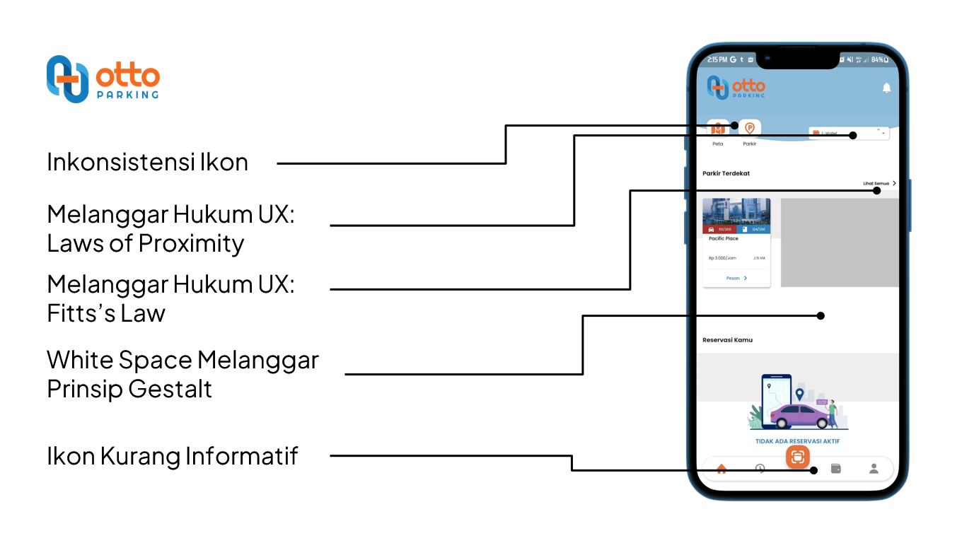
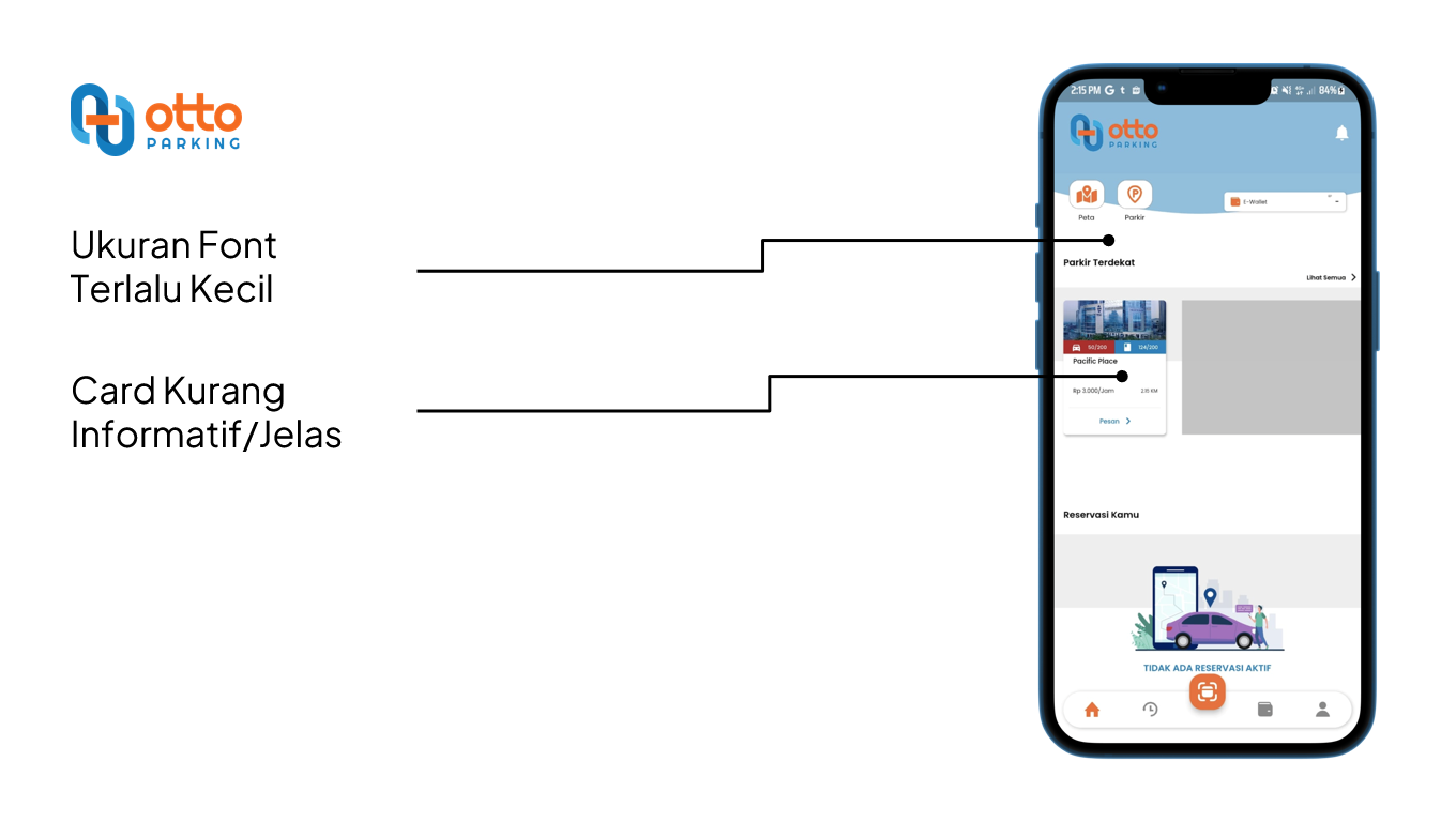
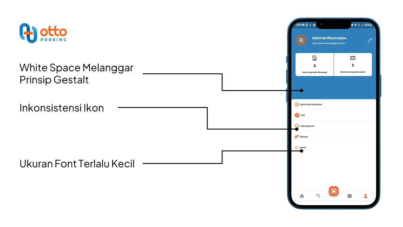
Subsequent to the competitive audit, I identified several UX law violations present in the Otto Parking application design, including:
1. Inconsistent Iconography:
The inconsistency in iconography within the Otto Parking application led to confusion and a lack of clarity for users. Icons are visual cues that should have consistent meanings across the application to facilitate quick and intuitive understanding. When icons are inconsistent in style or meaning, users may struggle to interpret their purpose correctly, leading to usability issues and potential frustration.
2. Violation of the UX Law of Proximity:
The violation of the UX Law of Proximity in Otto Parking's design disrupted the logical grouping of related elements. This law dictates that items that are visually related should be placed close to each other to signify their connection. When this principle is violated, users may struggle to perceive the relationships between different interface components, hindering their ability to navigate and comprehend the application's functionality.
-
B. Relevance to User Needs:
The design reflected the insights gained from user research. Layouts were optimized to prioritize essential actions and information, ensuring that users could easily find and interact with features that catered to their needs.
-
C. Intuitive Navigation:
The new design embraced user expectations, facilitating intuitive navigation patterns. Elements like call-to-action buttons were strategically placed for easy accessibility, enhancing the usability of the application.
-
D. Positive User Experience:
By adopting Clean Design and UCD principles, the Otto Parking application became a platform that delighted users with its aesthetic appeal, simplicity, and user-centric features. The interface allowed users to seamlessly manage parking, make valet reservations, and process payments, resulting in a holistic and gratifying experience.
In summary, the implementation of Clean Design and User-Centered Design concepts facilitated the transformation of Otto Parking into an intuitive and visually appealing application. By aligning the design with the company's visual identity and incorporating user preferences, the redesigned application achieved a harmonious balance between functionality, aesthetics, and user satisfaction.
UI Design Process:
1. Steps in Creating a New User Interface:
The creation of Otto Parkings new user interface involved a well-defined and iterative process that aimed to address existing issues and align with the company's rebranding efforts:
-
A. User Research and Analysis:
Understanding user needs, preferences, and pain points was the starting point. The previous design's weaknesses were identified through competitive audits and user feedback analysis.
-
B. Ideation and Conceptualization:
With a clear understanding of user expectations, I initiated the ideation phase. This involved brainstorming ideas, exploring design directions, and sketching out potential interface layouts.
-
C. Wireframing and Prototyping:
Wireframes were created to establish the layout, hierarchy, and flow of the new interface. Prototyping followed, using tools that allowed for interactive exploration of the design's functionality.
-
D. User Testing and Iteration:
The initial prototype was subjected to user testing sessions to gather feedback and insights. This iterative process helped identify usability issues and refine the design based on real user interactions.
-
E. Visual Design and Brand Alignment:
Leveraging the insights gained from user testing, the visual design phase began. Clean Design principles were embraced to ensure a modern and cohesive appearance.
-
F. Implementation and Development Collaboration:
Collaboration with the development team was essential to translate the design into a functional interface. Continuous communication ensured that the envisioned design was executed accurately.
-
G. Testing and Quality Assurance:
Rigorous testing was conducted to ensure the interface's functionality, responsiveness, and adherence to UX principles. Any issues were addressed promptly to guarantee a seamless user experience.
-
H. Launch and Feedback Loop:
Once implemented, Otto Parking's new interface was launched. User feedback continued to be collected post-launch, providing insights for further improvements and enhancements.
2. Choice of Colors, Typography, and Other Design Elements:
In alignment with Otto Parking's rebranding initiative, the choice of colors, typography, and design elements played a pivotal role in shaping the application's new visual identity:
-
A. Colors:
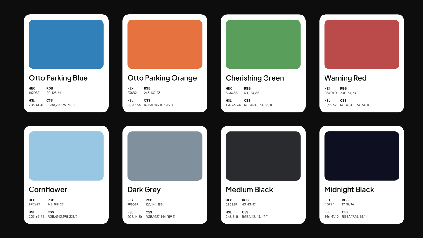
The color palette was carefully curated to evoke a sense of modernity, professionalism, and approachability. A combination of vibrant and soothing colors was chosen to create visual interest and guide users' attention. The primary color reflected the brand's new identity, which are called Otto Parking Orange and Otto Parking Blue, while secondary colors added depth and contrast.
-
B. Typography:
Typography played a crucial role in ensuring readability and visual harmony. A balanced blend of fonts, including the Plus Jakarta Sans typeface, was selected, with particular emphasis on legibility across various devices. The chosen typefaces, complemented the modern aesthetic and resonated with the brand's personality (also, it’s beautifully free. Kudos to 6616 and Tokotype for this! 😉)
This intentional choice of typography not only enhanced the user experience but also contributed to maintaining a consistent and visually appealing design throughout the Otto Parking interface.

-
C. Design Elements:
Design elements were chosen to align with the modern and user-centered approach of Otto Parking's redesign. Clear and consistent iconography was employed to enhance user understanding and facilitate navigation. Elements such as buttons, cards, and form fields were designed with attention to user interaction, aiming for an intuitive and seamless experience.
In conclusion, the UI design process for Otto Parking encompassed a strategic approach that aimed to rectify existing design flaws while aligning with the company's rebranding goals. By meticulously selecting colors, typography, and design elements, the new interface was not only visually appealing but also user-friendly and in sync with the brand's refreshed identity.
Comparison: Before and After The Redesign


The visual comparison above illustrates the transformation that Otto Parking underwent, transitioning from the original design to the meticulously crafted redesign. The improvements made are not only visible but also reflect the commitment to creating a seamless and engaging user experience.
2. Redesigned Icon Results
The redesigned icons for Otto Parking reflect a unified and cohesive visual language that enhances user recognition and interaction. Each icon has been carefully crafted to align with the rebranding efforts and to ensure intuitive understanding for users. This set of icons and graphics exemplifies how consistent design principles can lead to a more user-friendly and aesthetically pleasing application.
3. Implementation of Improvements
The redesign of Otto Parking was a comprehensive effort aimed at addressing several key issues identified in the original design. To enhance the user experience and align with the company's rebranding initiatives, the following improvements were implemented:
-
A. Consistent Iconography:
The previously inconsistent icons were replaced with a standardized set that adheres to a unified visual language. This not only ensures clarity in understanding but also fosters a cohesive look and feel across the application.
-
B. UX Law Adherence:
The UX Law of Proximity was upheld by reorganizing elements logically, ensuring related items are placed close together. Additionally, Fitts' Law was respected by enlarging interactive elements, enhancing usability and reducing errors in interaction.
-
C. Optimized White Space:
The application's white space was carefully adjusted to align with Gestalt principles, promoting better visual organization and focusing users' attention on essential content.
-
D. Enhanced Typography:
Font sizes were increased to improve readability, providing users with a more comfortable reading experience and minimizing strain on their eyes.
-
E. Clearer Cards and Layout:
Ambiguity and confusion were addressed by redesigning cards and layout elements to provide clear information and intuitive user paths. This ensured that users could seamlessly navigate through the app and access information without hesitation.
Through these improvements, the redesigned Otto Parking application now offers a visually appealing, user-centric, and consistent interface that aligns with the rebranding efforts and upholds international standards of usability and aesthetics. The project's success lies in its ability to not only resolve design flaws but also to elevate user satisfaction, engagement, and overall usability.
Results and Impacts

1. Final Refreshed Interface
The culmination of the Otto Parking redesign effort resulted in a completely refreshed user interface that harmonized modern aesthetics with enhanced usability. The key visual improvements include:
-
A. Consistent Iconography:
An array of well-designed and consistently styled icons that now provide users with clear visual cues, enhancing understanding and interaction across the application.
-
B. Optimized Proximity:
Adhering to the UX Law of Proximity, interface elements are thoughtfully grouped together, aiding users in quickly identifying related components and their functions.
-
C. Fitts' Law Adherence:
Interactive elements, such as buttons and clickable areas, have been appropriately sized and strategically positioned, complying with Fitts' Law. This ensures ease of interaction and reduces errors.
-
D. Effective White Space Usage:
Gestalt principles are now embraced, resulting in a harmonious design with appropriately utilized white space. This improves visual clarity, focusing users' attention on relevant content and actions.
-
E. Clear and Informative Icons
A library of icons that have been refined for clarity and relevance. Users can now confidently comprehend the meaning behind each icon, enabling efficient navigation.
-
F. Enhanced Readability:
Font sizes have been optimized for various devices, improving readability and overall user experience. Legible typography ensures that users can access information comfortably.
-
G. Intuitive Card Design:
Cards have been restructured to be clear, concise, and easily understandable, empowering users to quickly process information and make informed decisions.
2. Positive Impact of Redesign on Users and Business
The redesign of Otto Parking has brought forth a multitude of positive outcomes for both users and the business, creating a transformative impact:
-
A. Enhanced User Experience:
With an intuitive and visually appealing interface, users now find it easier to navigate, understand, and utilize the application's features. This seamless experience leads to increased user satisfaction and engagement.
-
B. Improved Accessibility:
The adherence to UX principles, such as proper iconography, legible typography, and optimized interactive elements, ensures that the application is accessible to a broader range of users, including those with varying abilities.
-
C. Reduced User Errors:
The implementation of Fitts' Law and consistent iconography has reduced the likelihood of user errors when interacting with the application. This diminishes frustration and elevates user confidence.
-
D. Boosted Business Reputation:
A user-centered design approach reflects the company's commitment to providing exceptional user experiences. This enhances the brand's reputation, fostering positive associations with user-centricity.
-
E. Increased Engagement and Retention
A more enjoyable and efficient user experience encourages users to spend more time within the application, exploring its features comprehensively and leading to higher user retention rates.
-
F. Competitive Differentiation:
By addressing previous design issues and aligning with the company's rebranding, Otto Parking stands out in a crowded market. Its visually appealing, user-friendly design sets it apart from competitors and attracts new users.
-
G. Business Growth:
The positive user experience resulting from the redesign translates into improved customer loyalty and recommendations, driving business growth and expansion in the digital parking sector.
In conclusion, the revamped Otto Parking interface embodies the successful amalgamation of modern design principles and user-centered thinking. The positive impact on user satisfaction, engagement, and the company's reputation underscores the profound significance of the redesign, showcasing the power of UI/UX in driving meaningful and lucrative change.
Learnings from the Otto Parking Redesign Process:
Throughout the design process of the Otto Parking project, I gained numerous valuable insights that went beyond mere technical design aspects. Some of these include:
-
1. User-Centric Significance:
This process reaffirmed the importance of understanding and serving user needs in every step of design. Creating a positive user experience remains the top priority in crafting successful interfaces.
-
2. Solid Team Collaboration:
I realized the significance of close collaboration between designers, developers, and other stakeholders. Strong communication and team synergy allowed us to accurately bring the design vision to fruition.
Shout out my bestest internship teammate, Aqsa and Gito who has realized the prototype into an App that can be used. Also big thanks for my mentors, Pak Edo, Pak Fikri, Pak Khalid, and Pak Kevin who have accompanied and guided me in working on this project.
-
3. Iterative Iterations:
An iterative cycle in design is key to success. Gathering user feedback, identifying issues, and continuously developing improved solutions result in interfaces that get better over time.
-
4. Importance of User Research:
Thorough user research serves as a strong foundation for effective design. Collecting data and insights from users guides design decisions based on facts and user preferences.
Insights Applicable to Future Projects:
Armed with experience from the Otto Parking project, I can identify several invaluable insights to apply to my future UI/UX projects:
-
1. Prioritizing a User-Centered Approach:
Given the success achieved through a user-centered approach, I will continue to apply User-Centered Design principles in future projects. Focusing on user needs and preferences is key to creating successful interfaces.
-
2. Leveraging Best Practices:
The experience from Otto Parking highlights the importance of leveraging best practices and industry standards in design. This ensures that my designs are always up-to-date with the latest trends and user expectations.
-
3. Implementing Effective Collaboration:
This process underscores the importance of effective communication with the development team. Strong collaboration helps avoid barriers and ensures that the resulting design aligns with the shared vision.
-
4. Opportunities for Growth:
I recognize that every project is an opportunity to learn and grow. Therefore, in future projects, I will continue to seek opportunities to develop my skills and knowledge in UI/UX design.
Overall, the experience from the Otto Parking project not only enhanced my technical UI/UX design skills but also enriched my understanding of the significance of user understanding, teamwork, and continuous growth as a designer.

