Project
What I did
Redesign, UI/UX
Release
May 2023
Collaborators
Revolutionizing toll road engagement through innovative UI/UX fusion.
Application Description and Problem Solving:
Nusantara Infrastructure Toll Apps (NITA) is a transformative mobile application developed by PT Nusantara Infrastructure Tbk for PT Margautama Nusantara (PT Nusantara Infrastructure Subsidiary for Toll Road Development), a key player in Indonesia's road infrastructure development sector. Recognizing the critical role of road networks in the country's economic growth, the company aims to enhance accessibility to goods and services through the advancement of road infrastructure.
NITA addresses the following challenges:
Rebranding Alignment: PT Margautama Nusantara embarked on a rebranding journey to enhance its visual identity and align with modern design principles. The previous user interface violated essential UX laws, displaying inconsistent icons, layouts, color palettes, typography, and a dated appearance. The application's lack of intuitiveness hindered user engagement and satisfaction. To rectify this, a fresh design approach was needed, leading to the adoption of Clean Design principles and a User-Centered Design methodology.
User-Centric Solution: As the UI/UX Designer, my role was pivotal in devising a solution that encompassed both the company's rebranding aspirations and the users' needs. Employing Clean Design principles, the new interface aimed to simplify visual elements, promote clarity, and create an aesthetic that resonated with users. User-Centered Design guided the process, prioritizing user research, iterative prototyping, and user feedback incorporation.
Rebranding Background and My Role:
PT Margautama Nusantara, a subsidiary of PT Nusantara Infrastructure Tbk, emerged in 2007 with the mission of propelling Indonesia's road infrastructure development. Over the years, the company evolved into a holding entity for road infrastructure firms. From the inception of road projects in Makassar to the expansion of BSD toll road lanes and the construction of the Tallo II Bridge, PT Margautama Nusantara established itself as a vital player in advancing road networks.
As the UI/UX Designer, my role entailed more than merely crafting an interface. It involved bridging the gap between the company's aspirations and the users' needs. By addressing UX violations, inconsistent elements, and outdated design, I played a pivotal role in the transformation. The adoption of Clean Design principles ensured visual harmony, while User-Centered Design placed users at the core. The new iconography, designed to align with the company's broader visual identity, imparted consistency across the application suite.
NITA's Functionality:
NITA is an application tailored to the road travel experience, specifically in Makassar. It offers a range of features, including:
- 1. Favorite Destination Detection:
Utilizing the user's location, NITA directs them to their preferred destinations within Makassar. Cards display distances and travel times, with comparisons between travel routes using PT Margautama Nusantara's toll roads and alternative routes.
- 2. Toll-related Information:
Users can access features such as CCTV feeds from toll roads, toll gate tariffs, and e-Money balance checks. Additionally, essential road services information (such as fire, ambulance, police, and towing services) is readily available.
- 3. Map of Makassar Toll Roads:
NITA provides a comprehensive map of the Makassar toll road network for users' reference.
- 4. Digital Toll Receipts:
Users can conveniently download their toll road travel receipts digitally.
- 5. Tourist Destination Information:
NITA assists users in discovering popular tourist destinations in Makassar. The application promotes the use of PT Margautama Nusantara's toll roads to reach these attractions.
- 6. Membership and Rewards System:
NITA offers a unique rewards system, encouraging users to use PT Margautama Nusantara's toll roads. Points earned translate into membership levels (Silver, Gold, Platinum), influencing users' likelihood of receiving rewards from the company.
In conclusion, the NITA application exemplifies the successful convergence of rebranding efforts with User-Centered Design principles. By resolving UX issues, aligning visual elements, and enhancing user experience, NITA redefines road travel in Makassar while contributing to PT Margautama Nusantara's overarching objectives in the road infrastructure sector.
In-Depth Explanation of Original Design Challenges:
The original design of NITA was marred by a multitude of issues that had a detrimental impact on user engagement and satisfaction. These problems necessitated a comprehensive redesign effort grounded in the Attitudinal-Qualitative research method and aligned with the International Standard (ISO-9126) for Software Evaluation. The issues that plagued the original design encompassed:
- 1. Visual Incoherence:
The absence of visual alignment and inconsistency in design elements led to confusion and hampered user experience.
- 2. Violation of UX Laws:
Several UX laws were infringed upon, resulting in suboptimal user interactions and a lack of adherence to established design principles.
- 3. Unintuitive Interface:
The interface's lack of intuitiveness impeded users from navigating the app effortlessly, leading to frustration and reduced engagement.
- 4. Outdated Aesthetics:
The UI/UX of NITA had become obsolete, failing to resonate with modern design trends and users' evolving expectations.
- 5. Non-Compliance with Standards:
Failure to align with the fresh design standards of PT Nusantara Infrastructure (Otto Parking and Otto Admin) further strained the user experience.
Redesign Objectives and Vision:
The NITA redesign was driven by a visionary approach to overcome its existing limitations and enhance user satisfaction. The overarching goals of the redesign were:
- 1. Visual Coherence:
To achieve a unified visual identity across the application suite, creating a seamless and modern user experience.
- 2. Compliance with UX Laws:
Rectify the violations of UX laws and incorporate Jakob’s Law, harnessing Clean Design principles familiar to users from other applications.
- 3. Simplicity & Ease:
Streamline user flow, ensure user-friendly application usage, enhance navigation, and elevate the clarity of information.
- 4. Applying UX Laws and Clean Design:
The redesign of NITA was anchored in the application of UX laws, notably Jakob's Law, to establish a familiar user experience framework. Clean Design principles were infused to facilitate easy user adoption and navigation, enhancing overall usability and appeal.
- 5. Embracing Simplicity & Ease:
The redesign of NITA pursued the concept of Simplicity & Ease, aiming to simplify user journeys, improve comprehension, enhance navigational clarity, and amplify information clarity. These efforts were meticulously woven into the fabric of the redesigned interface.
- 6. Aligning with UX and Nusantara Infrastructure New Design Standards:
The focus of NITA's redesign was twofold: rectifying design issues to align with UX principles and harmonizing the interface with other Nusantara Infrastructure applications, applying the Law of Similarity.
The necessity for the redesign of NITA stemmed from various compelling reasons:
- 1. Visual Alignment:
NITA suffered from visual inconsistencies, compromising its overall appeal and user engagement.
- 2. UX Law Violations:
Violations of UX laws hindered the optimal user experience and compromised the usability of the application.
- 3. Intuitiveness Deficit:
The unintuitive nature of the interface impeded seamless navigation, leading to user frustration.
- 4. Outdated Interface:
NITA's UI/UX had fallen behind contemporary standards, diminishing its appeal and usability.
- 5. Alignment with New Standards:
The redesign aimed to realign NITA with the fresh design standards adopted by other PT Nusantara Infrastructure applications.
Chosen Strategy: User-Centered Design
The chosen strategy for NITA's redesign was the User-Centered Design approach. This decision was rooted in the following rationales:
- 1. User-Centric Focus:
Elevating user satisfaction through an in-depth understanding of user needs aligned with business interests.
- 2. Competitive Edge:
Superior user experiences set NITA apart, attracting new users and promoting market leadership.
- 3. Business Performance Enhancement:
Enhanced user satisfaction and brand reputation contribute to increased revenue through transaction volume growth.
- 4. Business-Design Nexus:
User-centered design augments business objectives, fostering growth, profitability, and long-term sustainability.
In conclusion, the NITA redesign journey epitomizes the fusion of modern design
principles, user-centricity, and strategic business objectives. By addressing
design flaws, adhering to international standards, and embracing Clean Design
and User-Centered Design, NITA aims to reshape road travel experiences while
advancing PT Margautama Nusantara's mission within the Indonesian road
infrastructure landscape.
Research Methodology and User Analysis:
In the pursuit of creating an enhanced user experience for Otto Parking, a multi-faceted research approach was undertaken. While in NITA, a competitive audit wasn't conducted due to already well-received features, in Otto Parking, a comprehensive competitive audit was the first step. This audit facilitated the identification of industry trends, user preferences, and best practices. Subsequently, an Attitudinal-Qualitative research method was employed to gather user insights and preferences. Through surveys, interviews, and usability testing, user expectations and pain points were discerned.
Detailed Explanation of UX Law Violations, Layout Issues, Typography, and More:
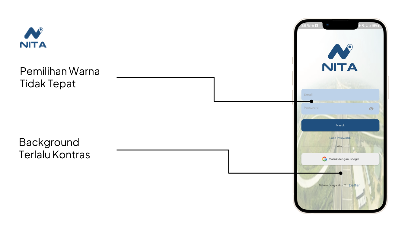
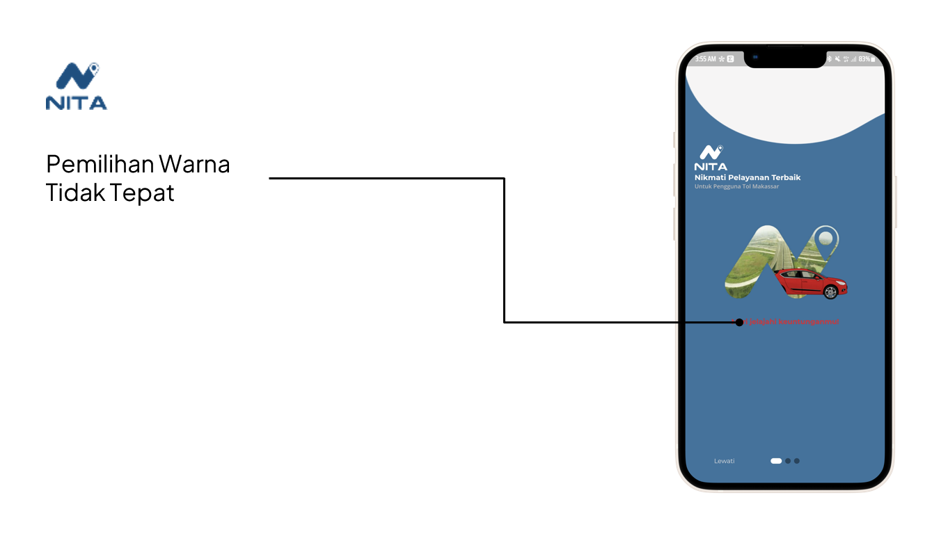
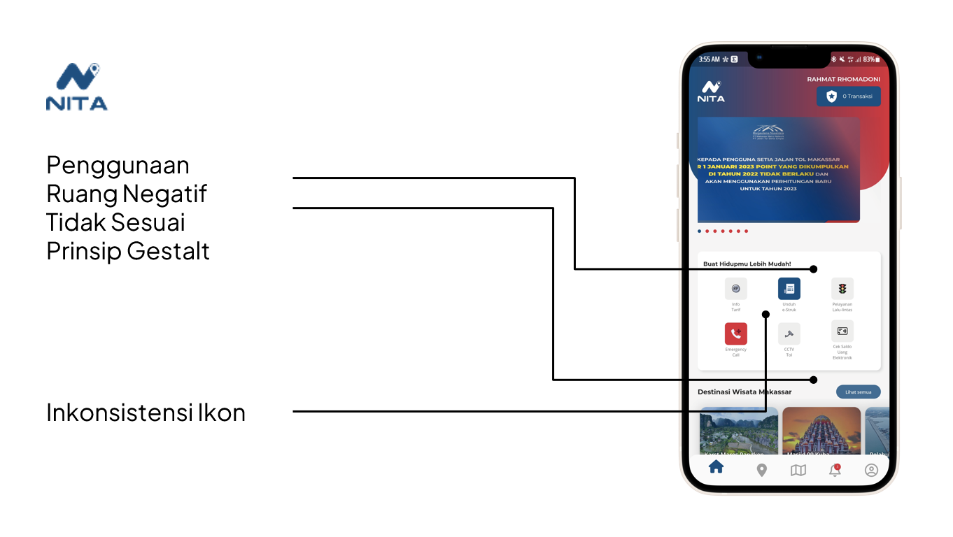
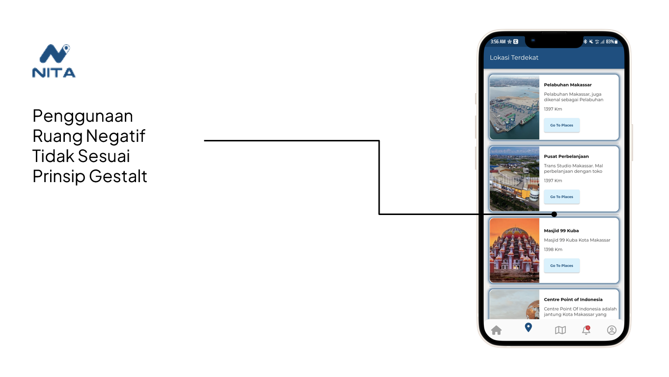
The analysis of Otto Parking's design uncovered several UX law violations and design issues, as detailed below:
- 1. Inconsistent Icons:
The presence of varied iconography across the application confounded user understanding, leading to confusion.
- 2. Inaccurate Color Selection:
The choice of colors was not harmonious and failed to convey the intended message. The color palette needed refinement to ensure clear communication.
- 3. Contrasting Background:
The excessively contrasting background created visual discomfort and disrupted visual unity, diminishing user experience.
- 4. Violation of UX Laws of Proximity:
The lack of logical grouping of related elements violated the UX Law of Proximity, causing cognitive load for users.
- 5. Violation of Fitts' Law:
The inadequately sized interactive elements disregarded Fitts' Law, making precise interaction difficult.
- 6. White Space Mishandling:
The inappropriate use of white space ignored Gestalt principles, hampering content organization and user flow.
- 7. Unclear and Informatively Poor Icons:
Icons that failed to convey clear meanings and lacked informative value resulted in user confusion and hindered task completion.
- 8. Too Small Font Size:
The implementation of font sizes that were too small compromised readability and user comprehension.
- 9. Ambiguous Cards:
Cards were lacking in clarity and information, leading to ambiguity and user uncertainty during interactions.
The Focus of NITA Redesign:
In NITA, the primary design challenges were rooted in outdated design elements, inconsistent icons, and improper utilization of negative space in defiance of Gestalt principles. The pivotal focus of the NITA redesign was to realign design with UX principles, particularly the Law of Similarity, to ensure a harmonious visual experience across all Nusantara Infrastructure apps.
The redesign process for NITA sought to rectify these issues and create a cohesive and visually engaging user experience that aligned with the established UX principles and design standards. The outcome of this effort was a design that not only addressed the identified flaws but also enriched user engagement and satisfaction.
Through this comprehensive redesign, NITA was transformed into an intuitive, visually appealing, and user-centric platform that upheld the highest UX standards while showcasing the transformative potential of UI/UX design in the digital realm.
More About Clean Design and User-Centered Design:
The NITA project was meticulously guided by the principles of Clean Design and User-Centered Design (UCD), ensuring a harmonious and user-centric interface that catered to both user needs and the brand's aspirations.
Clean Design: The application's interface was crafted with Clean Design in mind, embracing minimalism, simplicity, and visual clarity. This approach aimed to declutter the visual landscape, prioritize essential content, and provide users with an uncluttered and delightful experience. The design featured ample white space, a consistent color palette, and typography that was carefully chosen for legibility. By adhering to Clean Design principles, NITA's interface was aesthetically pleasing and focused on guiding users seamlessly through their tasks.
User-Centered Design (UCD): UCD formed the foundation of the redesign process, ensuring that user needs and preferences drove every design decision. Rigorous user research, including attitudinal-qualitative studies, was conducted to deeply understand user behaviors, motivations, and pain points. This research informed the design's architecture, interactions, and visual elements, ultimately leading to an interface that resonated with the target audience.
Implementation of Company's Design Philosophy:
The integration of the company's design philosophy into the NITA interface was a collaborative effort aimed at aligning the redesign with the brand's identity and values.
- 1. Visual Consistency:
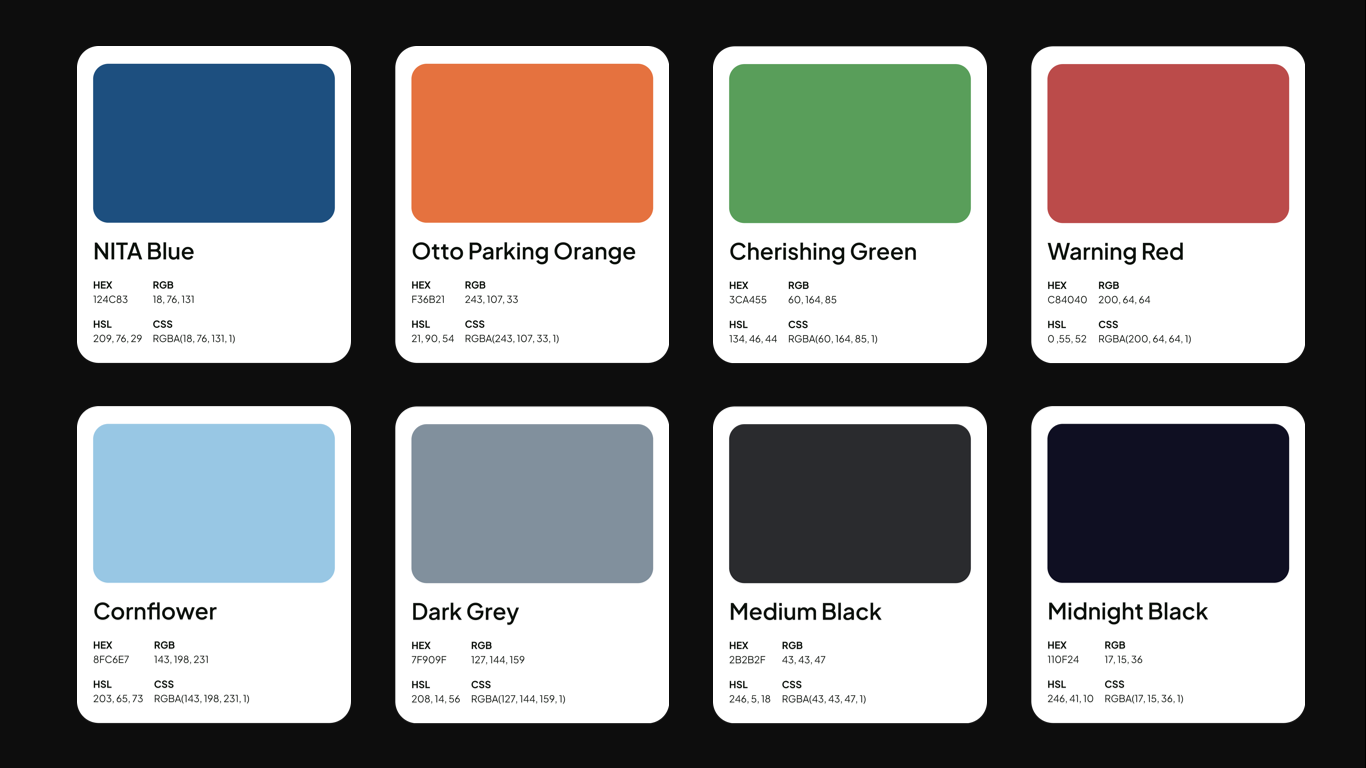

The new design elements seamlessly blended with the brand's visual identity, guaranteeing a consistent experience across all applications within PT Nusantara Infrastructure. Iconography, typography (the Plus Jakarta Sans typeface is by 6616 and Tokotype), and color choices were carefully curated to maintain a cohesive and harmonious visual language that resonated with the brand's essence.
- 2. Relevance to User Needs:
The redesign focused on addressing user needs identified through in-depth research. Layouts were thoughtfully optimized to emphasize crucial actions and information, allowing users to effortlessly navigate and engage with features tailored to their requirements. The interface became a reflection of the user's journey, ensuring a fulfilling experience.
- 3. Intuitive Navigation:
By embracing user expectations, the new design facilitated intuitive navigation patterns. Elements such as call-to-action buttons were strategically placed for easy accessibility, enhancing the usability of the application and improving overall user satisfaction.
- 4. Positive User Experience:
The combined principles of Clean Design and UCD culminated in an interface that not only looked appealing but also provided an exceptional user experience. Users could seamlessly navigate, interact with features, and access information, resulting in heightened user satisfaction, engagement, and loyalty.
In conclusion, the NITA redesign successfully embraced Clean Design and User-Centered Design principles to create an interface that resonated with users while upholding the brand's identity. The alignment between the redesign and the company's design philosophy ensured a consistent brand image, while the user-centered approach guaranteed a gratifying experience, further bolstering user loyalty and contributing to business growth.
Revamped Interface: A Modern and User-Centric LookThe culmination of the NITA redesign journey is showcased through the renewed user interface that harmoniously blends modern aesthetics with enhanced usability.


The pivotal visual enhancements encompass:
- 1. Consistent Iconography:
A meticulously crafted collection of icons that maintains uniformity across the application, providing users with a clear and intuitive visual language.
- 2. Optimized Proximity:
The principle of the UX Law of Proximity is effectively adhered to, grouping related elements together to facilitate quick identification and streamlined user interactions.
- 3. Fitts' Law Implementation:
Interactive elements, such as buttons and other clickable components, are thoughtfully sized and positioned in accordance with Fitts' Law, enhancing user interactions and reducing errors.
- 4. Effective White Space Utilization:
The judicious use of white space follows Gestalt principles, resulting in a balanced design that directs users' focus to essential content and actions.
- 5. Clear and Informative Icons:
A coherent set of icons designed for clarity and relevance, ensuring that users can readily comprehend their meanings and navigate the application with ease.
- 6. Enhanced Readability:
Font sizes have been thoughtfully adjusted for various devices, ensuring optimal readability and a comfortable user experience.
- 7. Intuitive Card Design:
Cards have been restructured to provide clear, concise, and easily understandable information, empowering users to make informed decisions seamlessly.
Positive Impact on Users and Business:
The redesigned NITA interface has ushered in a plethora of positive outcomes for both users and the business, creating a transformative impact that resonates far beyond aesthetics:
- 1. Enhanced User Experience:
The intuitive and visually appealing interface elevates user navigation, comprehension, and utilization of the application's functionalities. This seamless experience culminates in heightened user satisfaction and engagement.
- 2. Improved Accessibility:
Adherence to UX principles ensures the application is accessible to a broader spectrum of users, including those with varying abilities. This inclusivity enriches the user base.
- 3. Reduced User Errors:
The implementation of Fitts' Law and the consistent use of clear iconography have effectively diminished the chances of user errors during interactions, leading to reduced frustration and boosted user confidence.
- 4. Elevated Business Reputation:
The user-centered design approach is a testament to the company's dedication to providing exceptional user experiences. This fosters a positive brand reputation, bolstering associations with user-centricity.
- 5. Increased Engagement and Retention:
The improved user experience encourages users to engage with the application more extensively, leading to higher user retention rates and deeper exploration of features.
- 6. Competitive Distinction:
By addressing prior design issues and aligning with the overarching brand identity, NITA stands out in a competitive landscape. Its visually appealing and user-friendly design sets it apart, attracting new users and setting the application apart from competitors.
- 7. Business Growth:
The positive user experience engendered by the redesign results in improved customer loyalty, recommendations, and repeat transactions, propelling business growth and expansion within the digital market.
In summary, the revitalized NITA interface embodies the seamless fusion of contemporary design principles and user-centric philosophy. The far-reaching positive impact on user satisfaction, engagement, and the business's reputation underscores the profound significance of the redesign. This project illuminates the profound potential of UI/UX in driving impactful and lucrative change for both users and businesses alike.
Learnings:
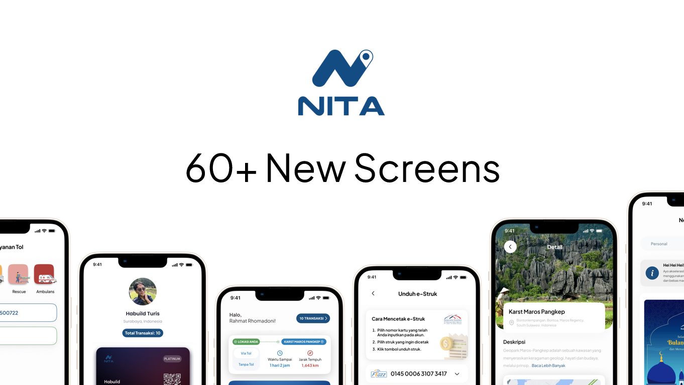
The NITA project has provided invaluable insights into the realm of UI/UX design, offering crucial takeaways that have enriched my understanding and proficiency in creating user-centric interfaces.
- 1. Understanding User-Centered Approach:
Through NITA, I deepened my grasp of the significance of a user-centered approach in UI/UX design. Conducting attitudinal-qualitative studies and empathetic research allowed me to truly comprehend user behaviors, preferences, and pain points. This understanding was integral in shaping an interface that resonated with users and catered to their needs.
- 2. Impact of Design Principles:
The project reinforced the power of design principles, particularly Clean Design and User-Centered Design, in crafting compelling user experiences. The application of Clean Design principles streamlined the visual language, prioritizing content and interactions. Incorporating User-Centered Design facilitated the alignment of the interface with user expectations, resulting in higher engagement and satisfaction.
- 3. Harmonizing Brand Identity:
The experience of implementing the company's design philosophy underscored the importance of maintaining brand consistency. Blending visual elements, such as typography and color, with the brand's identity contributed to a unified and professional look, enhancing the application's credibility.
Insights for Future Projects:
The insights garnered from the NITA project have equipped me with valuable lessons that can be seamlessly applied to future UI/UX endeavors.
- 4. Holistic User Research:
The extensive user research conducted for NITA emphasized the need for a comprehensive understanding of user behaviors, motivations, and pain points. This experience has reinforced the importance of in-depth research in creating designs that genuinely resonate with users.
- 5. Constant Iteration and Feedback:
The iterative nature of the design process in the NITA project highlighted the value of continuous improvement. Seeking and incorporating user feedback at every stage allowed for enhancements that aligned better with user expectations and preferences.
- 6. Adherence to UX Laws:
The identification and rectification of UX Law violations in NITA underscored the significance of adhering to these principles. Applying laws such as Proximity, Fitts' Law, and Gestalt Principles can significantly enhance usability, guiding users effectively through interfaces.
- 7. Seamless Brand Integration:
The integration of the company's design philosophy into NITA's redesign showcased the importance of harmonizing visual elements with the brand's identity. This lesson can be extended to future projects, ensuring consistency and authenticity in design across different applications and platforms.
- 8. Balancing Aesthetics and Functionality:
The successful balance achieved between Clean Design aesthetics and functional User-Centered Design in NITA is a vital lesson. This equilibrium ensures not only visual appeal but also a highly functional and user-friendly interface.
Overall, the NITA project has expanded my knowledge and skill set in UI/UX design by emphasizing user-centricity, design principles, brand alignment, and iterative refinement. These insights will undoubtedly guide my approach in future projects, enabling me to create designs that are not only visually captivating but also deeply resonant with users' needs and preferences.

